    In the Process:
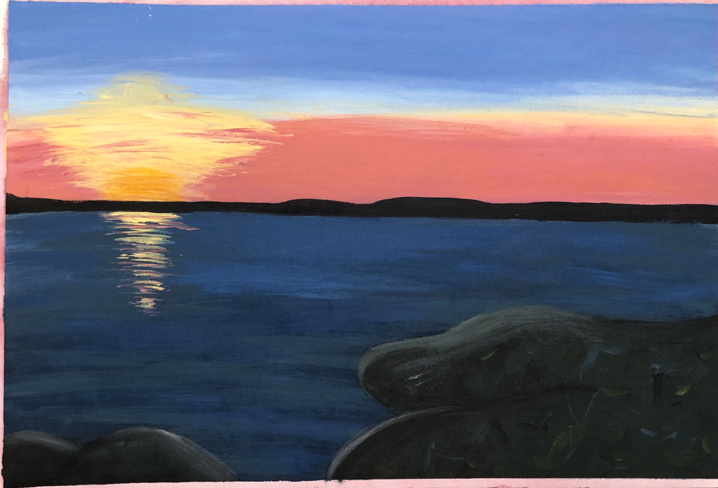
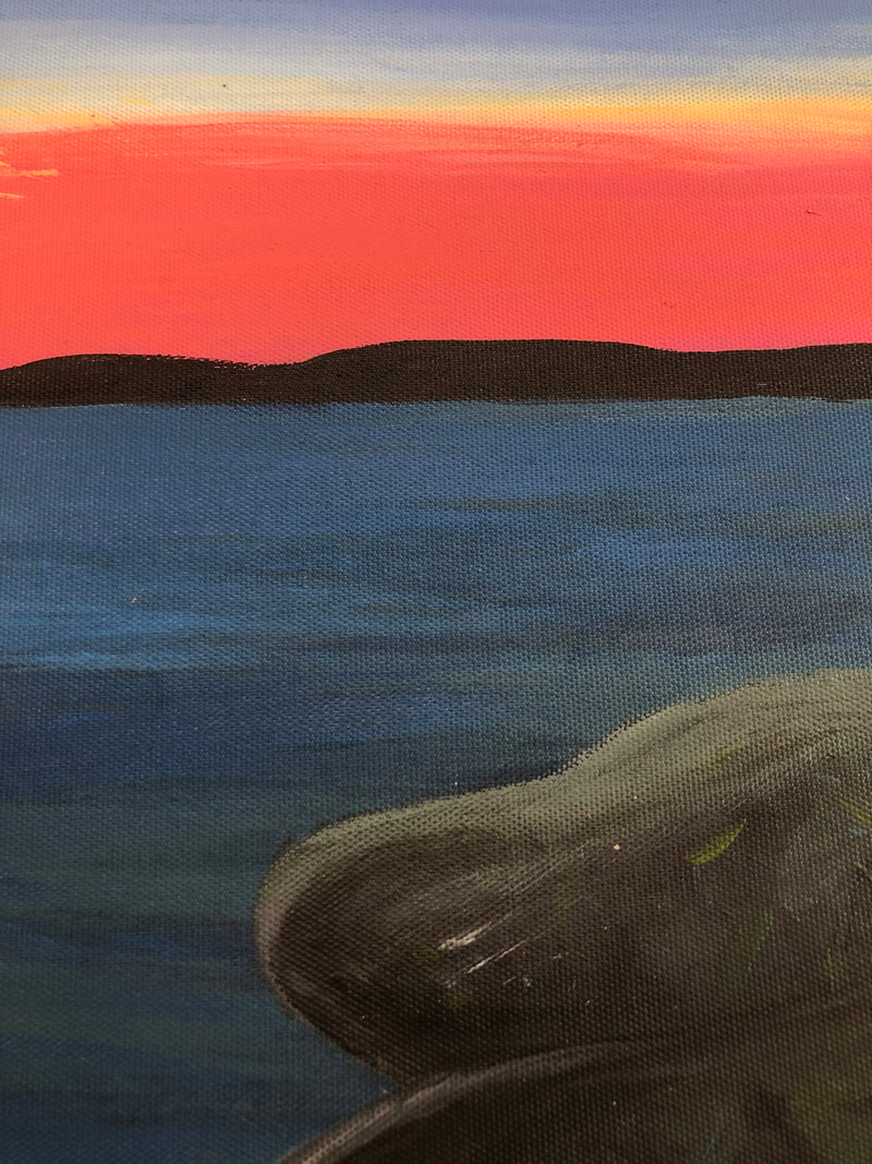
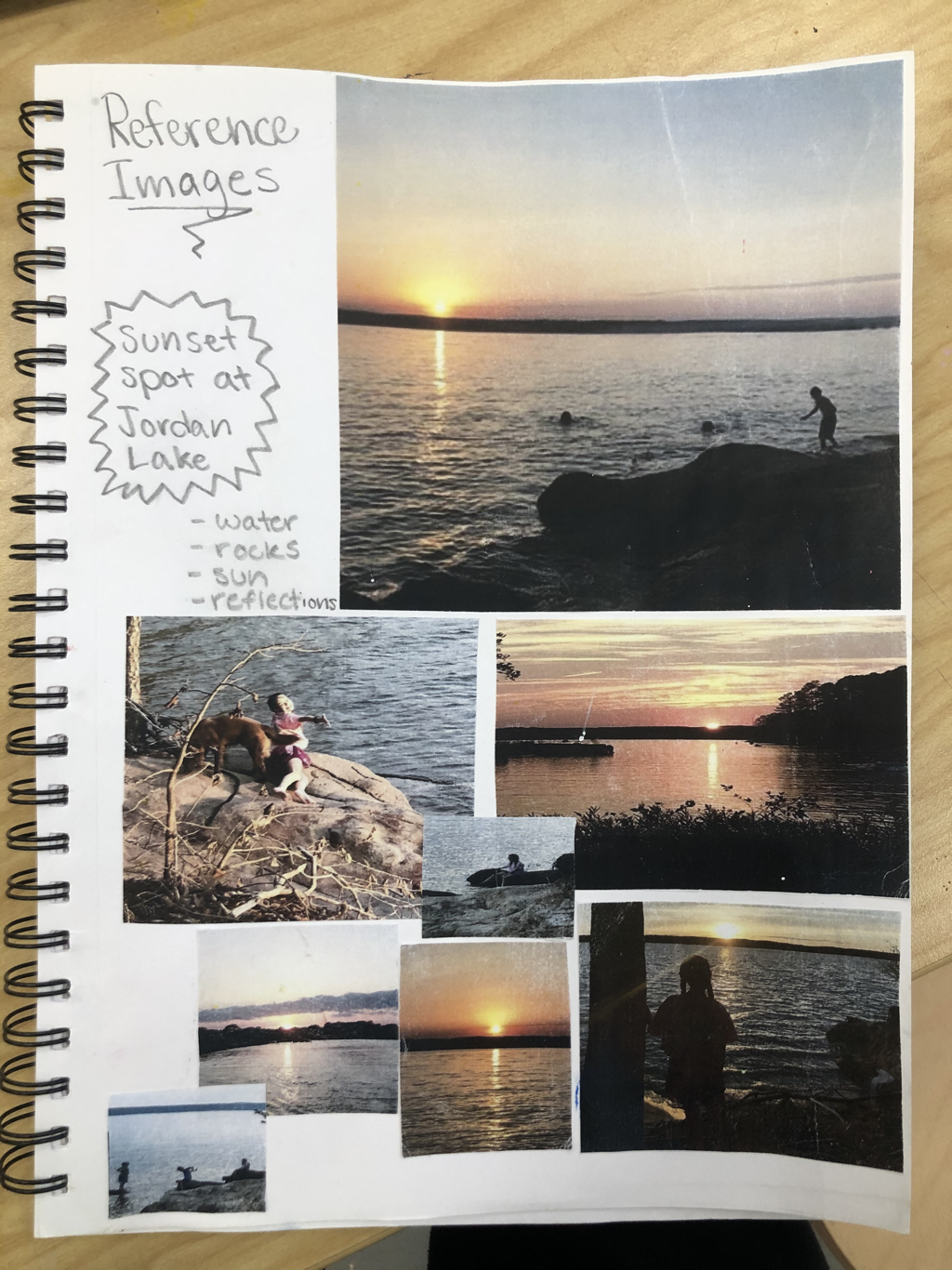
In the process we had to start by picking what size I wanted to make my painting and the I painted the whole thing red with water. Once I got everything sketched out on it I stated with my sky and moved down the painting to the water. Then I add the the sun and reflection, the little bit of land in the middle, and the big rock in the front. Lastly I added the highlights on the sun, water, and rocks. Describe: My piece is a painting of my neighborhoods favorite spot to hang out. Our sunset spot at the lake. There is a pinky blue sky with the sunsetting over the water. There are a few rocks that would be perfect to sit on to enjoy watching the sunset. Analyze: Color- My colors in my piece were a struggle to blend and make it look like a natural. I had to make sure that while blending the colors on my painting to not accidentally create a color that didn't belong. Proportion- My proportions were a little off at first with the sky, sun, water, and the big rock. Towards the end I was able to fix the proportions of the sky and water with the land between. I was also able to fix the big rock by blending the water more down. Interpret: My idea behind this piece was that this is one of my favorite places to be and some of my favorite memories come from there. Whenever my neighborhood goes camping we always try and find a special place to watch the sunset together. At Jordan Lake we found and amazing campsite from exploring and it's my favorite part of the trips. I wanted to paint this place because it means so much to me and I want to show other people just how beautiful it is. I wanted to show just how the colors blend and how it looks reflecting off the water. Judge: I found success in my sky blending of colors and how the sun reflected off the water. I learned in this assignment how to really blend paint and that adding water definitely helps. I also learned what kind of texture and technique I should use to paint the water and rocks. I also learned that multiply colors go into each part of the painting to make it look more 3D.
0 Comments
Leave a Reply. |
Drawing Unit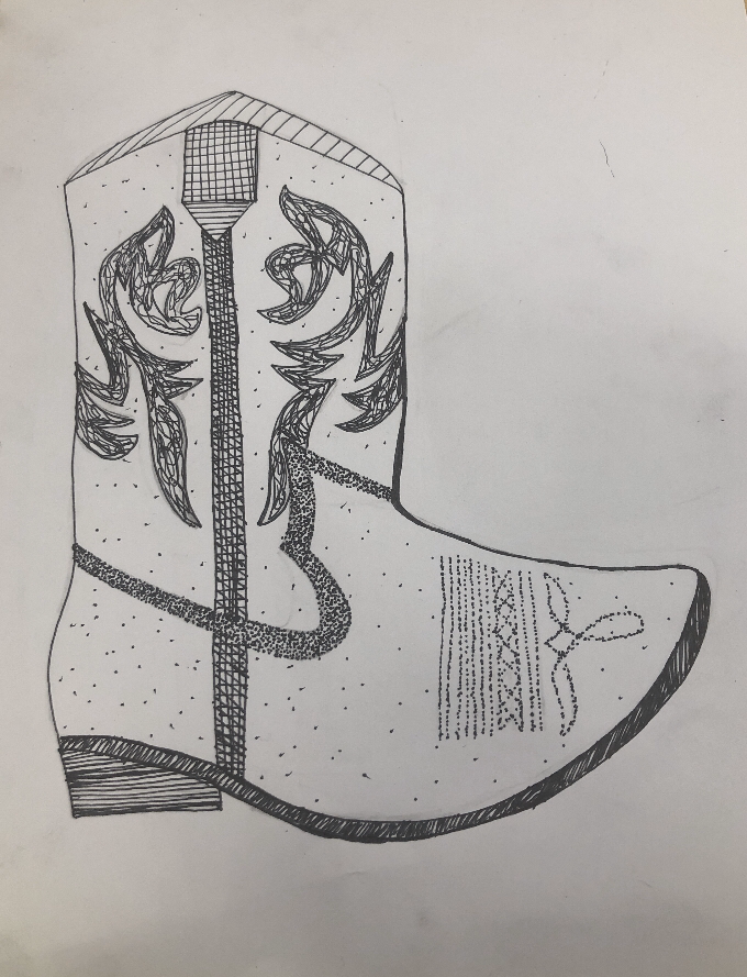
The warm up that was the most helpful for me was the upsidedown Picasso drawing. This warm up helped me only focus on some shapes at a time and keeping my preposition right. It help me not think too much about what part i was drawing was because I was only going shape by shape and because it was upsidedown.
Composition is how something is made up. Its the placement and arrangement of the visual ingredients. It means “putting together” and apply it to any art.
Value is the lightness or darkness of the color. White is the lightest value and black is the darkest. It defines the depth in the work of art. Pros for pencil drawings:
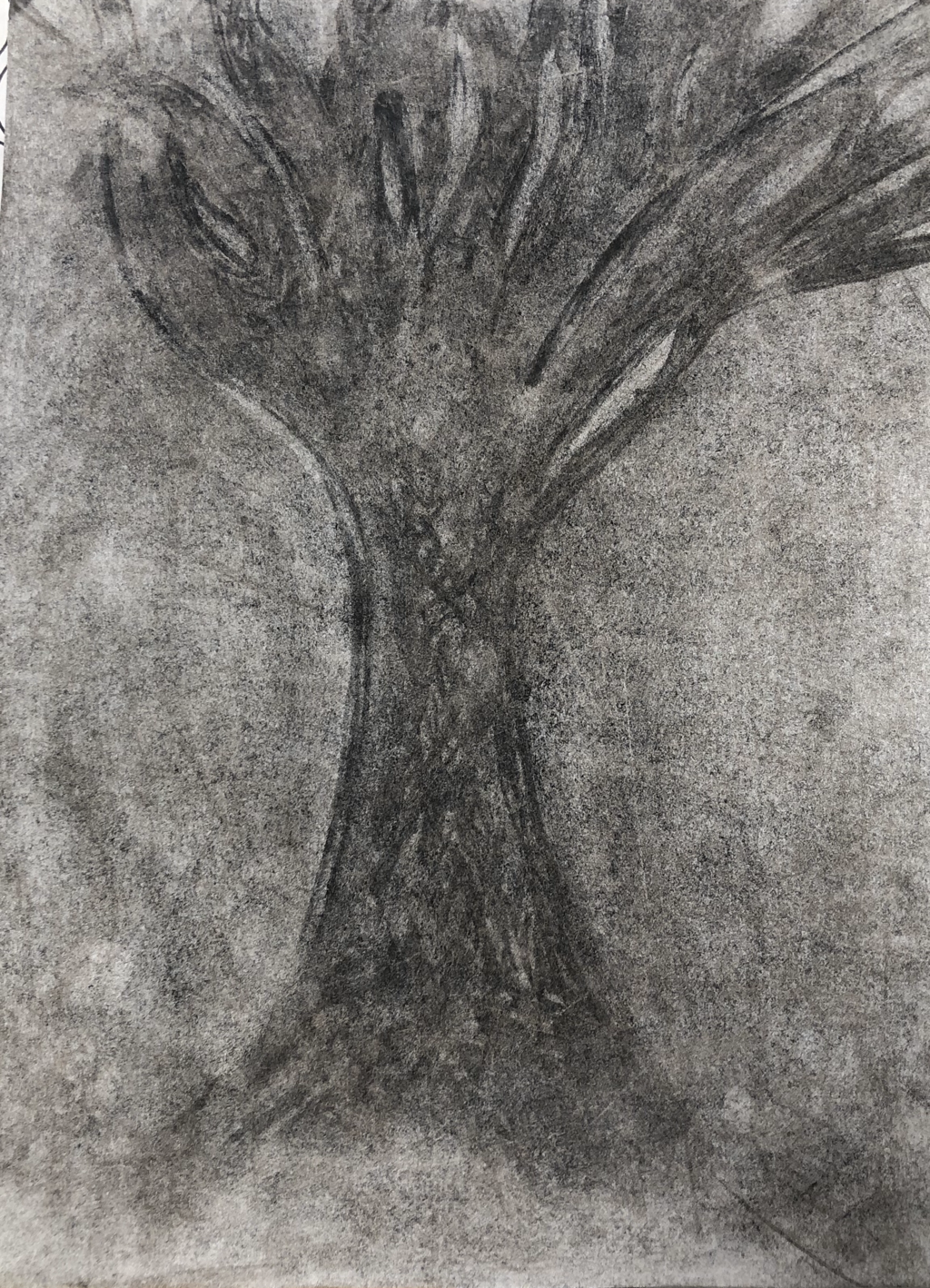
-Good for details because of the small tip -Easy to go back and forth with shades -Can be used at different angles for different textures Con for pencil drawings: -Harder to create shading Pro for charcoal:
-Can wipe away mistakes easily Con for charcoal: -Finger prints and gets snugged easily Pro for pen:
-Good for details and value Con for pen: -Can’t eraser Marianne Eriksen-Scott Hansen Art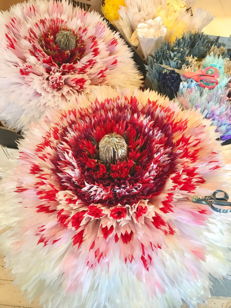
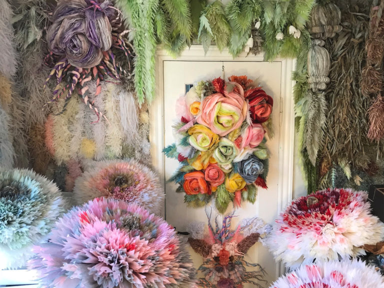
This art it done by Marianne Eriksen-Scott Hansen and she makes “paper couture”. She is located in Copenhagen, Asia. For years she has been making paper flower and her progress includes, cutting through 50 to 60 layers of paper at a time to create the flowers. Her work is inspiring to me because it’s 3D, colorful, and very different then most. The paper flowers look real and beautiful to look at. All the layers really make it stand out and detailed. Her work makes me want to work really hard to created something that I can be proud of and makes me happy.
Her instagram is - www.instagram.com/marianneeriksenscotthansen |
